![Item #1492 [AESTHETICS OF FONTS BY ARCHITECT CHERNIKHOV] Postroenie shriftov [i.e. Construction of Fonts]. Ia. Chernikhov, N., Sobolev.](https://bookvica.cdn.bibliopolis.com/pictures/1492.jpg?width=768&height=1000&fit=bounds&auto=webp&v=1661884267)
![[AESTHETICS OF FONTS BY ARCHITECT CHERNIKHOV] Postroenie shriftov [i.e. Construction of Fonts]](https://bookvica.cdn.bibliopolis.com/pictures/1492_2.jpg?auto=webp&v=1661884267)
![[AESTHETICS OF FONTS BY ARCHITECT CHERNIKHOV] Postroenie shriftov [i.e. Construction of Fonts]](https://bookvica.cdn.bibliopolis.com/pictures/1492_3.jpg?auto=webp&v=1661884267)
![[AESTHETICS OF FONTS BY ARCHITECT CHERNIKHOV] Postroenie shriftov [i.e. Construction of Fonts]](https://bookvica.cdn.bibliopolis.com/pictures/1492_4.jpg?auto=webp&v=1661884267)
![[AESTHETICS OF FONTS BY ARCHITECT CHERNIKHOV] Postroenie shriftov [i.e. Construction of Fonts]](https://bookvica.cdn.bibliopolis.com/pictures/1492_5.jpg?auto=webp&v=1661884267)
![[AESTHETICS OF FONTS BY ARCHITECT CHERNIKHOV] Postroenie shriftov [i.e. Construction of Fonts]](https://bookvica.cdn.bibliopolis.com/pictures/1492_6.jpg?auto=webp&v=1661884267)
![[AESTHETICS OF FONTS BY ARCHITECT CHERNIKHOV] Postroenie shriftov [i.e. Construction of Fonts]](https://bookvica.cdn.bibliopolis.com/pictures/1492_7.jpg?auto=webp&v=1661884267)
![[AESTHETICS OF FONTS BY ARCHITECT CHERNIKHOV] Postroenie shriftov [i.e. Construction of Fonts]](https://bookvica.cdn.bibliopolis.com/pictures/1492_8.jpg?auto=webp&v=1661884267)
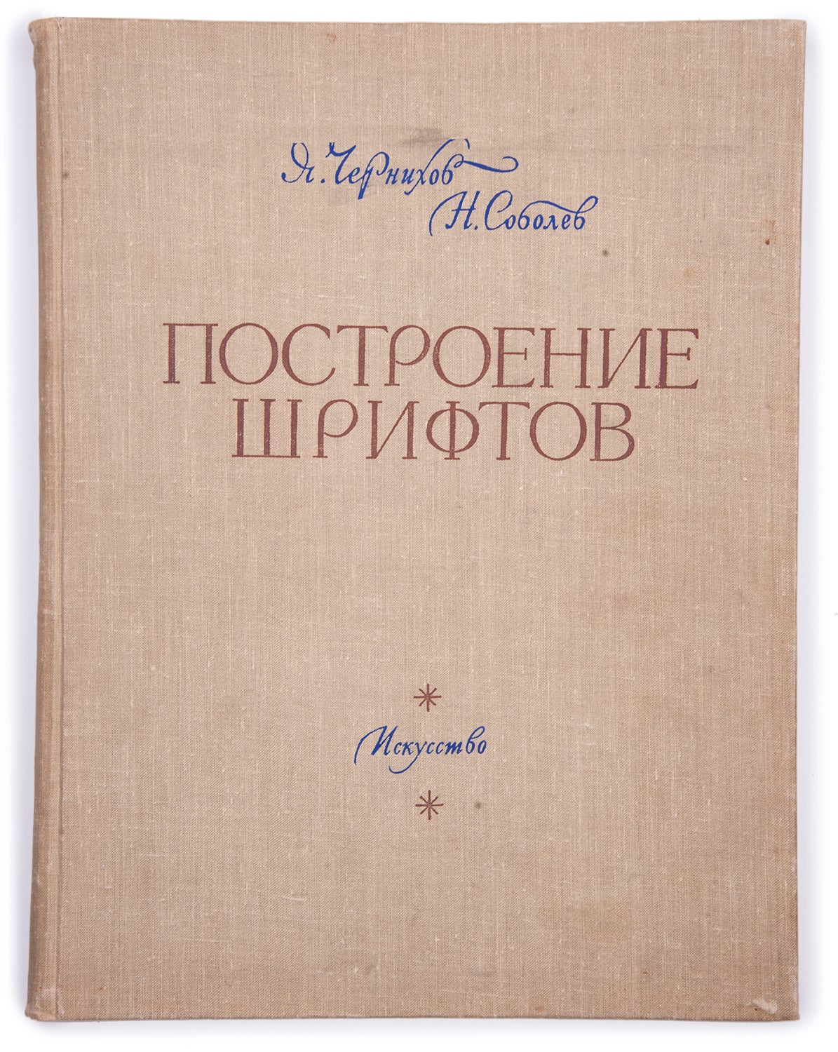
[AESTHETICS OF FONTS BY ARCHITECT CHERNIKHOV] Postroenie shriftov [i.e. Construction of Fonts]
Moscow: Iskusstvo, 1958. Item #1492
116 pp.: ill. 35x27 cm. In original cloth with two-color lettering on the front cover. Binding slightly rubbed, some Soviet bookshop stamps on endpapers, few pale stains, otherwise very good copy.
First edition, posthumous publication. One of 10000 copies. Rare. Design by the book and type designer Vadim Lazurskii.
Collaboration of one of the most unusual and innovative talents of the time, architect Yakov Chernikhov (1889-1951) and historian of book design and typeface Nikolai Sobolev. The latter wrote a couple of articles, commentaries to tables of fonts and managed to publish the book after Chernikhov had passed away.
Chernikhov is best-known for his ‘Architectural Fantasies’ while he was also a master of type design and paid sufficient attention to the construction of fonts and their history. In 1945, Chernikhov began to write ‘Architectural Fonts’ which was supposed to be a manual on architectural lettering, as well as fonts for technical drawings. Being into research, Chernikhov found extensive materials on the Russian writing system and typographics. He had been gathering them for several years, his work outgrew the previously planned framework and might be considered the theory of type design. Chernikhov developed a system of modular letter metrics and a precise geometric basis for the construction of some classic Russian fonts. Delicate graphics of most fonts required its reproduction with exact geometric structure. Some handwritten fonts were reproduced with calculations of their consistent pattern of construction.
Chernikhov applied principles of architectural theory to the construction of fonts, due to the common regularities. The drawings were made very clear and the value of the method lies in the fact that it provides a universal system for graphical analysis of all elements of any font.
The book is divided into two sections: the first one includes articles on the history of the world’s systems of writing, technical requirements and an explanation of the method of modular letter metrics. The second section consists of 31 tables made by Chernikhov himself. The tables contain the most significant and interesting Russian fonts of different periods, starting from the 11th century. All tables were arranged in chronological order, representing the development of the forms of Russian fonts and the geometric basis of their construction.
By the date of the book publication, some Chernikhov’s auxiliary lines were regarded as redundant by the followers, but in general, the role of this work in the development of Soviet graphic culture was highly appreciated.
Worldcat shows copies in LoC, Princeton, Harvard, Columbia, Maryland, Cornell, Binghamton, Hofstra Universities, Carleton College, NYPL.
Sold